Case Study
JE Cinema
Project overview

The product
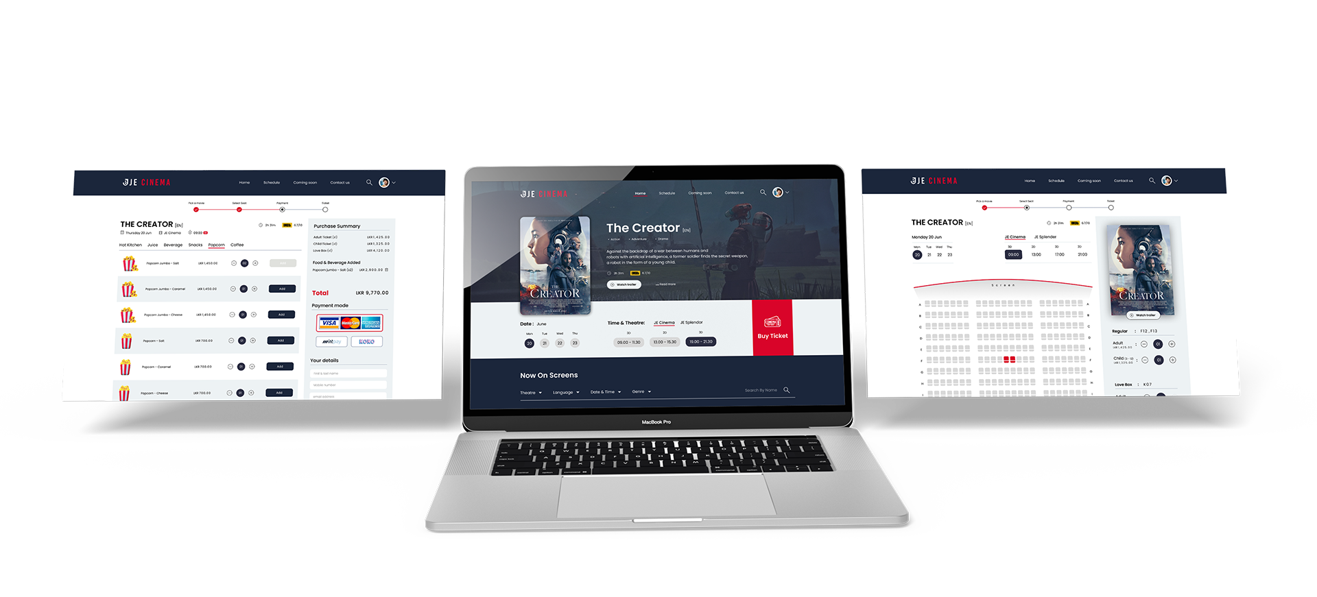
Discover the pinnacle of ease with our cutting-edge movie website. By choosing your perfect seats in advance, you may avoid standing in long lineups for tickets. Our website makes sure you make the most of your valuable time by blending effortlessly into your hectic life. Savor a worry-free moviegoing experience where your preferred seating is guaranteed, delectable snacks are available at the touch of a button, and ticket transactions are simple. In your hectic schedule, embrace the flexibility to slow down and appreciate each moment, spending less time waiting and more time on the things that really count.

Responsibilities
Interviewing, wireframing on paper and digital media, low- and high-fidelity prototyping, usability testing, taking accessibility into consideration, reworking designs, and responsive design.

The problem
Clunky online methods for buying movie tickets. Moreover, seamless access through desktop and mobile devices must be established.
The goal
Create a mobile-friendly, lightweight, and intuitive website that works on all devices.
My role
UX Design, UI Design and research
Understanding the user

Summary
To gain a deeper understanding of the target consumers and their needs, I conducted user interviews, which I later translated into empathy maps. I found that a lot of the target audience views buying movie tickets online as a fun and easy way to unwind after work or school.
However, a lot of ticket purchasing websites are difficult to use and overwhelming, which irritates a lot of target users. This negates the intention of relaxing by turning an otherwise enjoyable activity into a difficult one.

Pain points

Navigation
The layout of movie ticket websites are sometimes cluttered, making navigating difficult.

Interaction
Competition websites have small buttons that make it harder to choose items, which can occasionally cause users to make mistakes.

Secure seat
A lot of theaters may advertise that they have tickets available for a showing, but most people who watch movies avoid the front row seats. Users feel misled as a result of this.

Experience
Simple, uncomplicated, and easy to use.

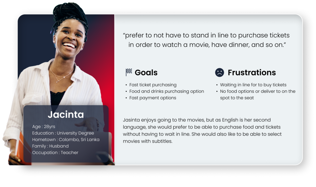
User persona

User journey map
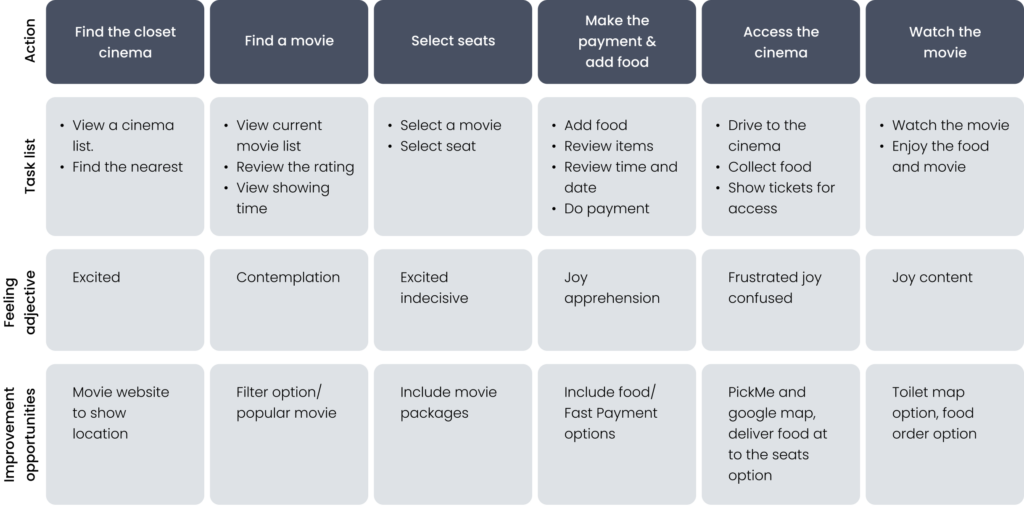
Jasinta’s user path was mapped out by myself in order to help pinpoint potential problems and areas for development.
Starting the design

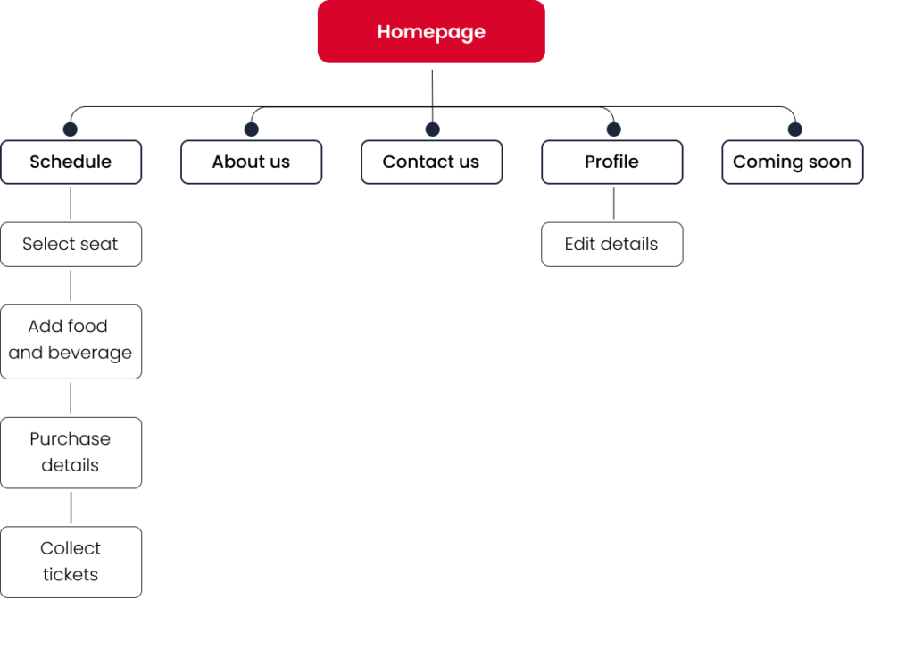
Site map
To gain a deeper understanding of the target consumers and their needs, I conducted user interviews, which I later translated into empathy maps. I found that a lot of the target audience views buying movie tickets online as a fun and easy way to unwind after work or school.
However, a lot of ticket purchasing websites are difficult to use and overwhelming, which irritates a lot of target users. This negates the intention of relaxing by turning an otherwise enjoyable activity into a difficult one.

Paper wireframes
I created paper wireframes for every screen in my site while considering the problems that users were having with browsing, navigating, and checking out. The home screen paper wireframe versions to the right concentrate on giving users the best possible browsing experience.
The components of each sketch that would be included in the preliminary digital wireframes were indicated by stars.

Digital wireframes

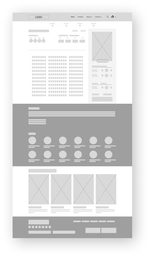
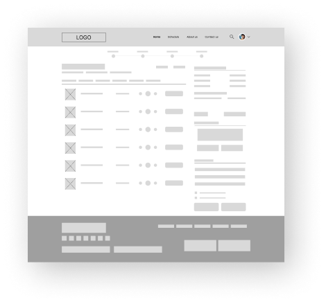
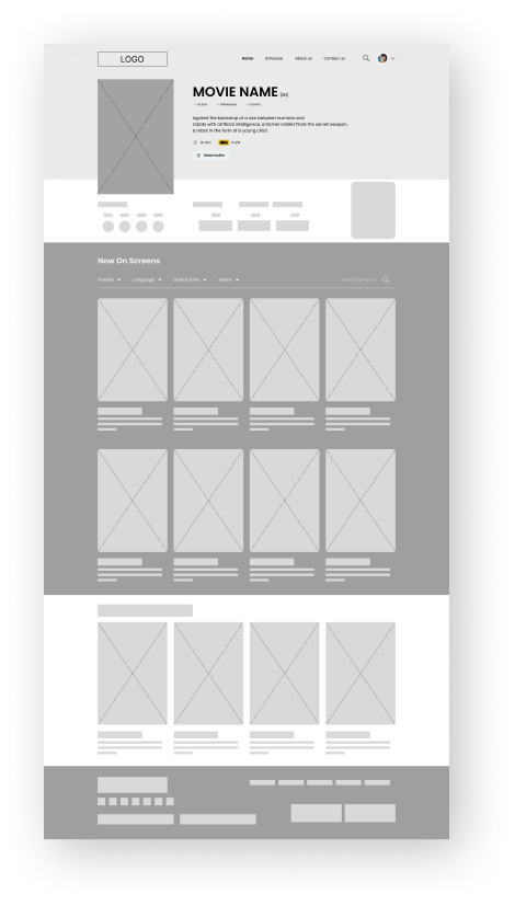

Low-fidelity prototype
I connected every panel in the main user flow to produce a low-fidelity prototype. By now, users had given me comments on my designs regarding things like button placement and page arrangement. I took the time to hear what they had to say, and I followed a few of their recommendations.

Usability study: parameters
Study type : Unmoderated usability study.
Location : Colombo, Sri Lanka.
Participants : 5 participants.
Length : 15 -30 minutes.

Usability study: findings

Tickets
The user was not given the ability to choose their movie seats after they reached the ticket screen.

Location
Customers couldn’t modify or choose their preferred movie theater on the ticket overview page.

Payment
The use of services like PayPal wasn’t made evident to customers during the checkout process.
Project overview

Usability study: findings
Before usability study
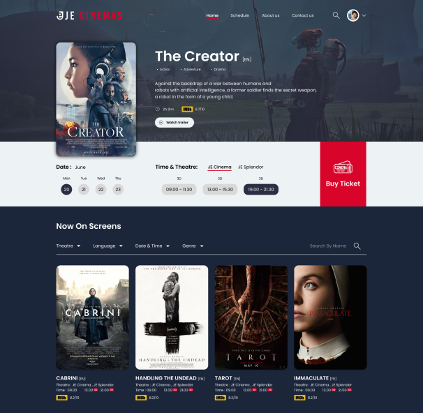
When user visit home page user not notice buy ticket is a button, so I made it as a button
After usability study
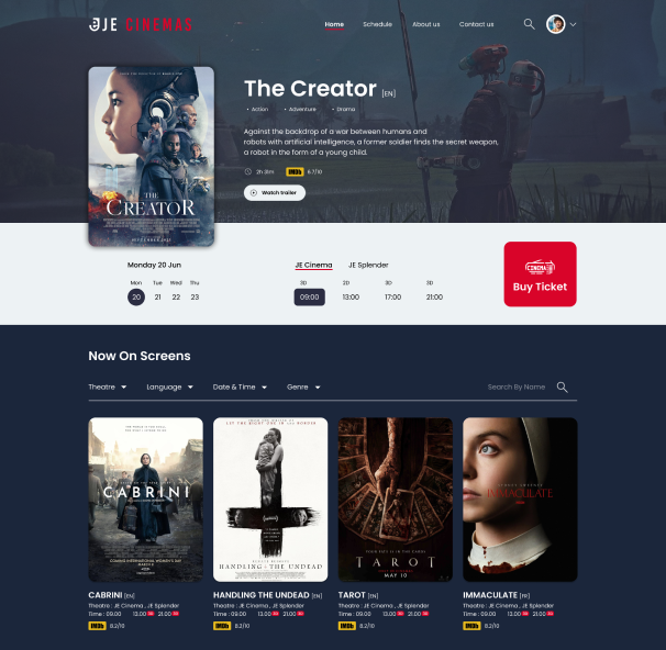
Before usability study

When user at payment step user can select other payment option like Mintpay, Koko pay which user can pay installment instead pay visa, master, American express
After usability study
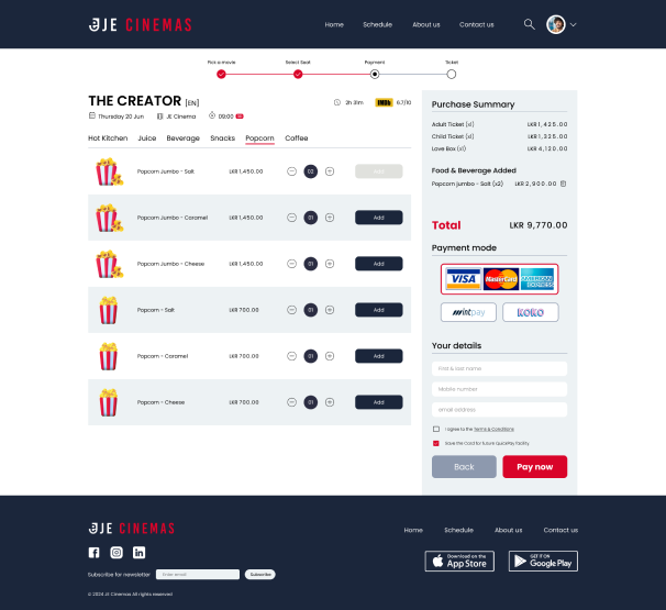

Mockups: screen size variations
Drawing from my previous wireframes, I made sure my mockups took into account different screen sizes. I believed it was critical to optimize the browsing experience for a range of device sizes, including mobile and tablet, because people purchase from a number of devices and I wanted to provide them the best possible experience.

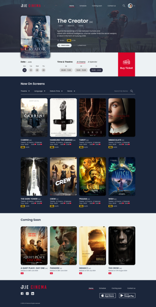

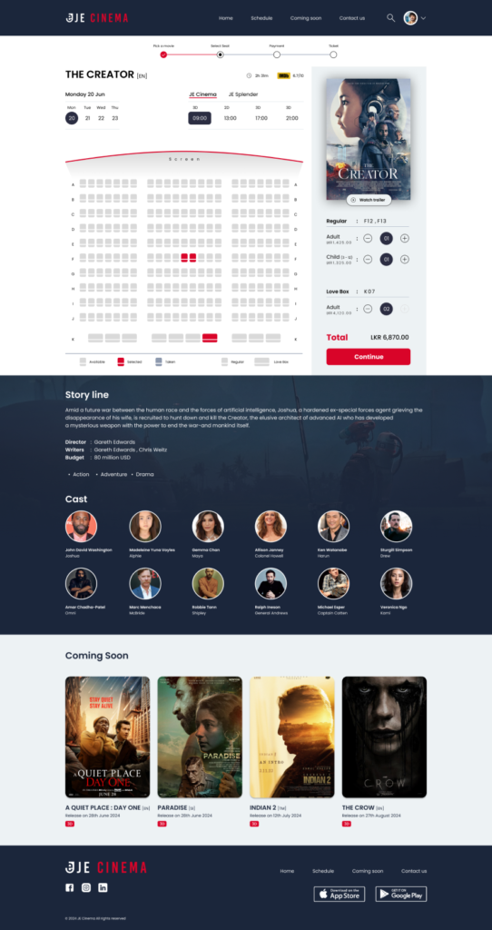

Hi-fidelity prototype
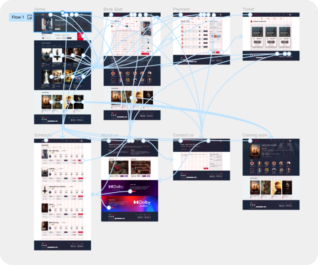
My high-fidelity prototype adhered to the identical user flow as the low-fidelity prototype, incorporated modifications to the design following the usability study, and incorporated multiple suggestions from my team members.

Accessibility considerations

For a clear visual hierarchy, I used headings with text that was sized differently.

In order to help with important UX conversion points within the layouts, I applied emphasized color theory.

Using very contrasting colors allowed for the greatest legibility.
Going forward

Impact
Our target audience commented that the design displayed a clear visual hierarchy, was easier to navigate, and was more engaging with the graphics.

What I learned
I discovered that a minor alteration in design can yield a significant effect on the user’s experience. For me, the most crucial lesson is to constantly keep the actual demands of the user in mind when developing design concepts and solutions.
